140+ CSS Menus
Navigation dictates orientation. Pure CSS Menu Examples remove the friction of JavaScript initialization, allowing interfaces to expand and collapse content natively. This collection provides professional, minimalist blocks for modern UI design, organizing complex link structures into digestible, tactile sequences. Utilizing these curated snippets guarantees layout stability while keeping the DOM transparent and fast.
Technically, these examples rely on the native <details> and <summary> elements or the checkbox hack for state management. The code utilizes Flexbox or CSS Grid for precise alignment and max-height transitions to animate visibility, leveraging hardware acceleration — animating properties like transform and opacity — to ensure 60fps performance on the compositor thread. The HTML structure remains strictly semantic, supporting accessible navigation without heavy dependencies.
Every free demo is fully responsive and cross-browser compatible. Users can instantly download the raw code or fork an updated interaction on CodePen. These assets are strictly optimized for performance, delivering a fast, frictionless experience across all modern desktop and mobile devices.
Examples

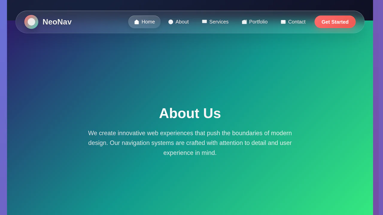
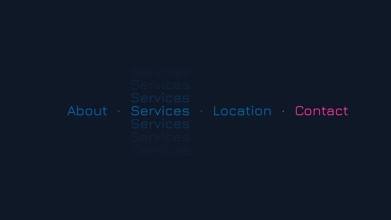
Split-Screen Staggered Menu Reveal
A full-screen navigation overlay driven by CSS transitions and data-attribute toggling. Clicking the menu button triggers a split-screen background slide, where two pseudo-elements converge from opposite vertical directions. The menu items and background typography fade in sequentially using CSS variable-based staggered delays, while hover states utilize -webkit-text-stroke and animated strikethrough lines.
 Chrome 49+
 Edge 12+
 Firefox 49+
 Safari 9.1+
See the Pen Split-Screen Staggered Menu Reveal.

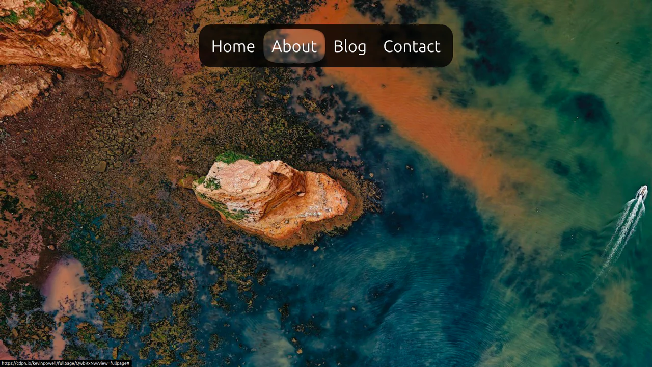
Elastic Anchor-Positioned Slider Navigation
An elegant, zero-JavaScript navigation bar powered entirely by CSS Anchor Positioning. Hover and active indicator bubbles are mapped dynamically to target links using pseudo-elements that reference custom --hovered-option and --active-option anchors. The sliding animations utilize a complex CSS linear() timing function to generate organic, elastic bouncing transitions.
Chrome 125+
Edge 125+
See the Pen Elastic Anchor-Positioned Slider Navigation.

Scroll-Driven macOS iOS Dock Concept
Pure CSS Scroll-Driven macOS iOS Dock recreates Apple’s legendary dock using the native CSS Scroll-Driven Animations API. Icons dynamically scale, blur, and shift depth completely without JavaScript. Utilizing @supports (animation-timeline: scroll()), the layout safely handles horizontal and vertical snaps. A zero-dependency, ultra-lightweight demonstrator of modern CSS capabilities. (Requires: gsap.js, scroll-trigger.js)
Chrome 115+
Edge 115+
Safari 26+
See the Pen Scroll-Driven macOS iOS Dock Concept.
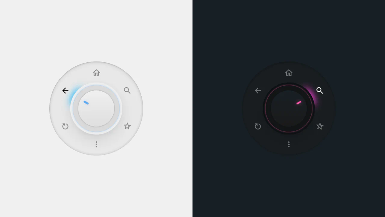
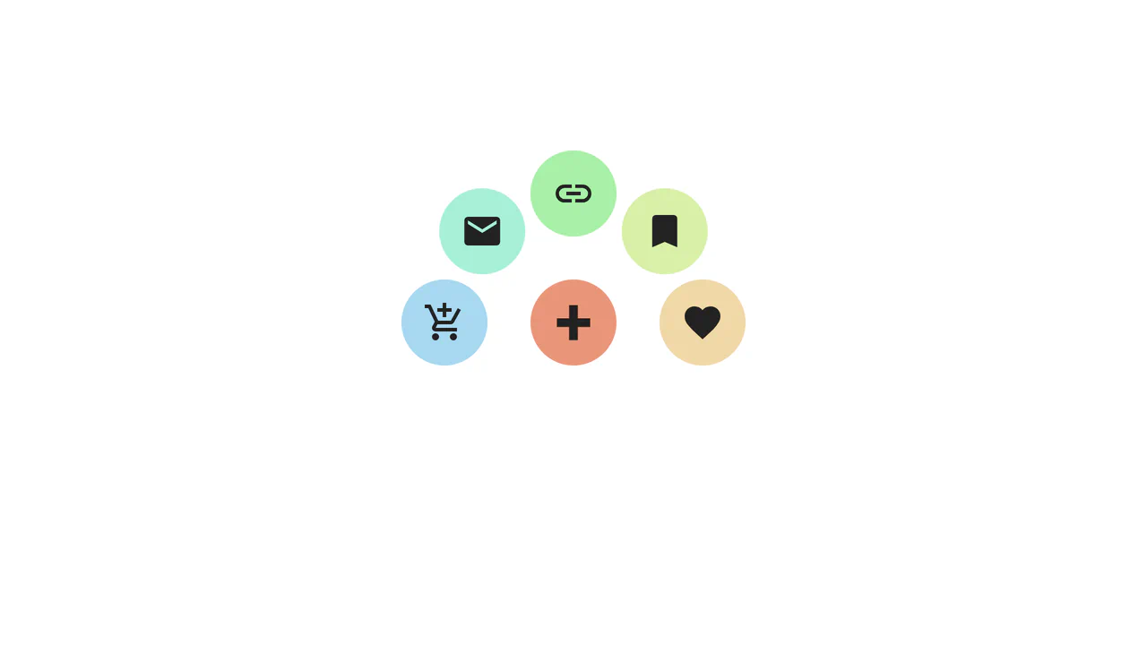
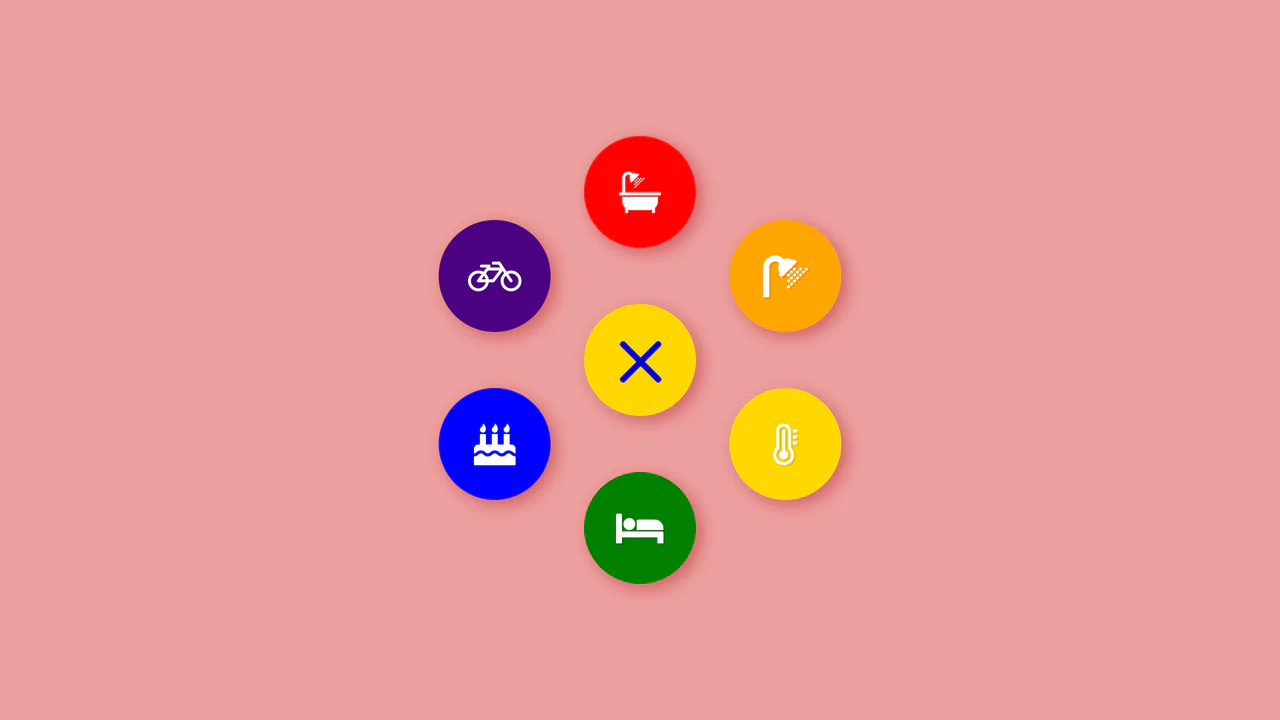
Radial Dial Control Menu
This is a Radial Dial Control Menu. It replaces traditional linear dropdowns with a rotary, hardware-inspired interface. Its function is to provide rapid, omnidirectional access to secondary actions, utilizing the user’s spatial memory and reducing cursor travel distance.
Chrome 115+
Edge 115+
Safari 16.4+
Firefox 128+
See the Pen Radial Dial Control Menu.
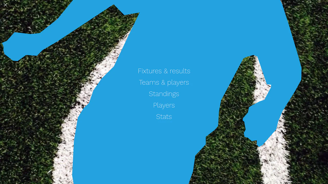
Liquid Polygon Fullscreen Navigation Menu
This is a Liquid Polygon Fullscreen Navigation Menu. It utilizes an intricate CSS clip-path mask to create an organic, ink-bleed reveal effect over the viewport. Its function is to replace standard rigid slide-in menus with a spatial, fluid transition, immediately altering the user’s interface context.
Chrome 55+
Edge 79+
Firefox 54+
Safari 13.1+
See the Pen Liquid Polygon Fullscreen Navigation Menu.
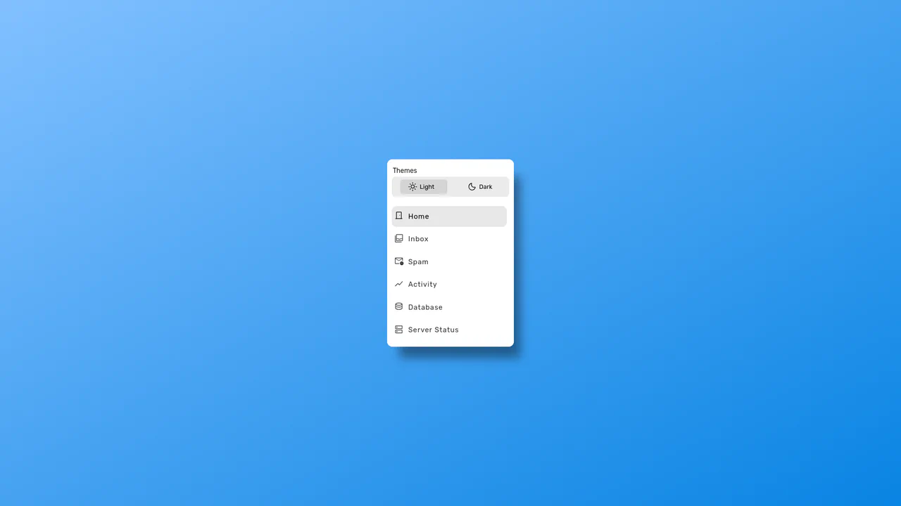
Polygon Sliced Theme Toggle Navbar
This is a Polygon Sliced Theme Toggle Navbar. It handles global light/dark mode switching and primary site navigation. Its function is to provide fluid, state-driven visual feedback using native browser APIs, eliminating abrupt visual jumps during context shifts. (Requires: normalize.css)
Chrome 111+
Edge 111+
Firefox 121+
Safari 17.4+See the Pen Polygon Sliced Theme Toggle Navbar.
Sliding Theme Toggle Sidebar Menu
This is a Sliding Theme Toggle Sidebar Menu. It integrates an interactive light/dark mode switch directly into a scrollable navigation panel. Its function is to provide centralized control over the application’s visual environment while maintaining immediate access to primary routing options.
Chrome 59+
Edge 79+
Firefox 52+
Safari 10.1+
See the Pen Sliding Theme Toggle Sidebar Menu.

Cinematic Parallax Reactive Navigation Menu
This is a Cinematic Parallax Reactive Navigation Menu. It synchronizes large-scale typographical navigation with multi-layered background shifts. Its function is to transform a standard menu into a high-end atmospheric gateway for editorial or premium portfolio websites, using user interaction to drive the visual narrative.
Chrome 80+
Edge 80+
Firefox 75+
Safari 13.1+
See the Pen Cinematic Parallax Reactive Navigation Menu.
Glassmorphic Advanced Navigation System
This is a Glassmorphic Advanced Navigation System. It provides a central, floating control hub for single-page applications. Its function is to persistently guide the user across different content sections while maintaining a high-end, translucent aesthetic that adapts fluidly between desktop and mobile environments.
Chrome 76+
Edge 79+
Firefox 70+
Safari 14+
See the Pen Glassmorphic Advanced Navigation System.
Trigonometric Radial Popover Menu
This is a Trigonometric Radial Popover Menu. It replaces heavy JavaScript positioning arrays with native CSS mathematics and the HTML Popover API. Its function is to reveal secondary actions in a circular layout on demand, expanding the interactive surface area without permanently cluttering the interface.
Chrome 139+
Edge 139+
See the Pen Trigonometric Radial Popover Menu.
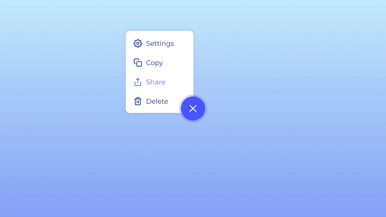
Morphing Hamburger Floating Action Button
This is a Morphing Hamburger Floating Action Button (FAB). It uses a combination of CSS transitions and keyframe animations to reveal a hidden context menu. Its function is to consolidate multiple secondary actions (Settings, Copy, Share, Delete) into a single, space-saving focal point. The interaction is initiated by a vanilla JavaScript class toggle.
Chrome 60+
Edge 79+
Firefox 55+
Safari 11.1+
See the Pen Morphing Hamburger Floating Action Button.
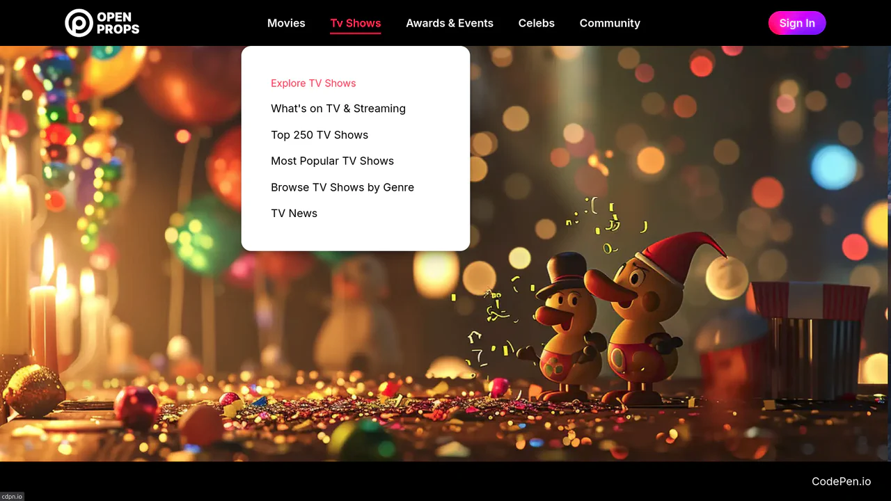
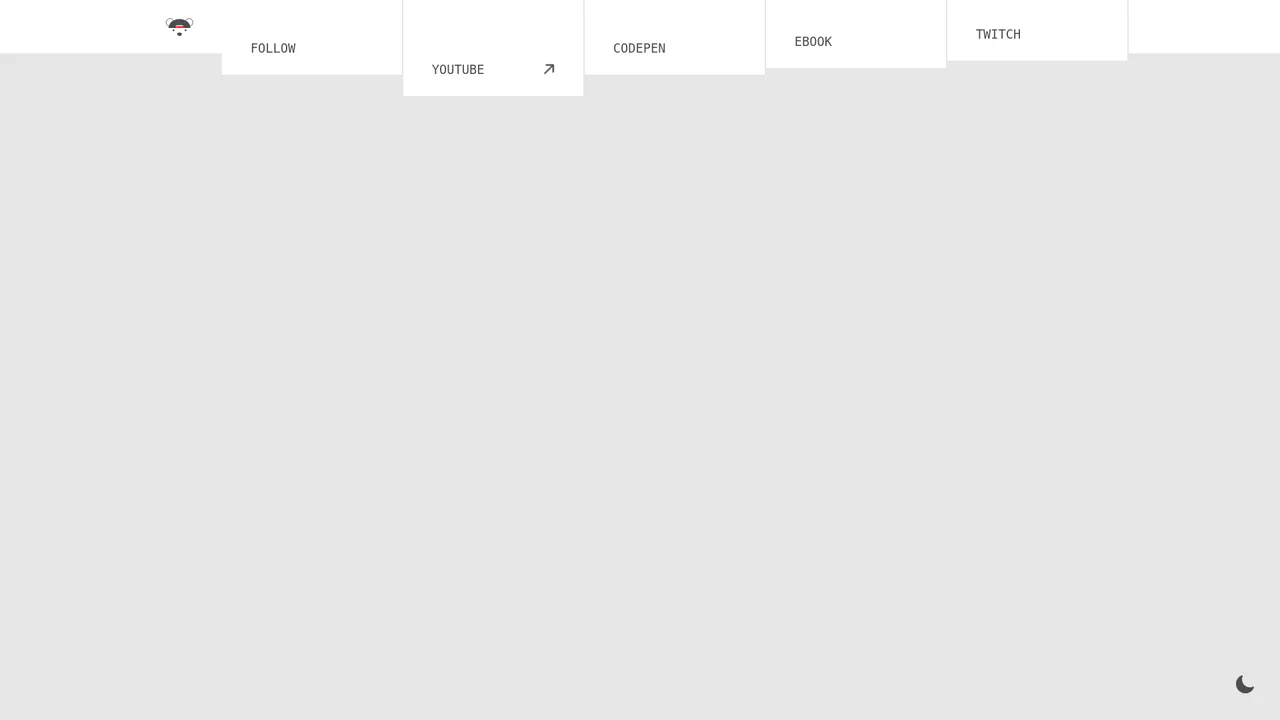
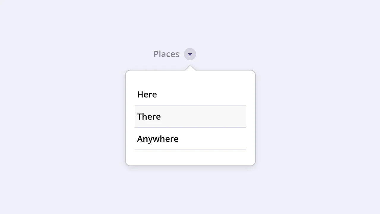
Dropdown Navigation
Navigation is the backbone of usability, but traditional dropdowns can feel cramped and elusive. This component expands the concept of a menu into a panoramic dashboard. It is not just a list of links; it is a structured map of your application’s architecture. (Requires: open-props, remixicon, normalize-css)
Chrome 99+
Edge 99+
Firefox 97+
Safari 15.4+
See the Pen Dropdown Navigation.
Vertical Ghost Text Hover Effect
This Vertical Ghost Text Hover Effect adds a spectral, sci-fi vibe to navigation menus without requiring extra HTML elements or pseudo-elements. By animating a stack of vertical text-shadows, the component creates a fading “echo” or “glitch” visual that expands outward when a user interacts with the link. It utilizes the modern light-dark() function to handle system theme preferences automatically.
Chrome 123+
Edge 123+
Safari 17.5+
Firefox 120+See the Pen Vertical Ghost Text Hover Effect.
CSS Anchor Positioning Navigation Effect
This CSS Anchor Positioning Navigation Effect is a masterclass in modern web standards, achieving a complex “sliding highlight” interaction entirely without JavaScript. By leveraging the new Anchor Positioning API alongside the :has() selector, the component allows a single background element to tether itself to whichever menu item is currently hovered, creating a premium, app-like feel with minimal code overhead.
Chrome 125+
Edge 125+
See the Pen CSS Anchor Positioning Navigation Effect.
Side Navigation with Icons
A vertical CSS-only navigation menu where hovering triggers a smooth animation: the icon scales up and changes color while the text label fades out, emphasizing the visual symbol.
See the Pen Side Navigation with Icons.

:has() Pseudo-Class Selector
An elegant and intuitive menu that helps the user focus on the item of interest by visually dimming the others.
See the Pen :has() Pseudo-Class Selector.
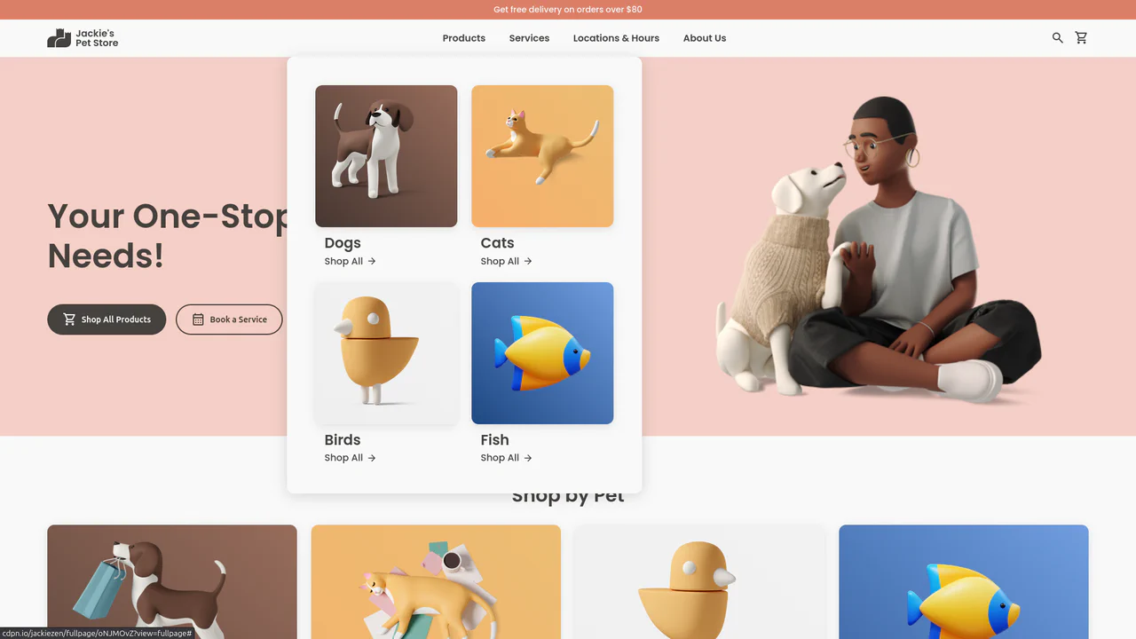
Jackie's Pet Store
A responsive pet store landing page built with CSS Grid and Flexbox. It features a dynamic navigation system with hover-triggered mega-menus, gradient-styled product cards with scale transitions, and a comprehensive use of CSS variables for consistent theming across breakpoints.
See the Pen Jackie's Pet Store.
Animated Menu Bar with Hamburger
A demonstration of a two-phase menu reveal animation - a fast transform: translateX shift and a slower width expansion are defined in a single transition property, creating a distinct visual effect.
See the Pen Animated Menu Bar with Hamburger.
Colorful Popup Hamburger Menu
A “fan-out” circular menu in pure CSS, where the hamburger icon animation and cascading item reveal are triggered by the “checkbox hack.” The reveal effect uses transform: translate3d() with transition-delay, and the animation’s liveliness is achieved through complex cubic-bezier curves, giving it a natural “elastic” bounce.
See the Pen Colorful Popup Hamburger Menu.
Mac Dock Magnify Effect with :has
A Dock menu where the scaling effect on hover is implemented entirely in CSS using :hover and :has() selectors - this allows scaling not only the active element but also its neighbors.
See the Pen Mac Dock Magnify Effect with :has.
Neon Icon Hover Effect
A navigation menu with a neon glow and a complex hover effect. Icons and text use the CSS drop-shadow filter to create a glow effect, while the element’s color is controlled via an inline CSS variable --clr.
See the Pen Neon Icon Hover Effect.
Emerging Dropdown Menu
This interactive component features a visually striking dropdown effect where the menu container morphs into shape using pure CSS animation of the SVG stroke-dashoffset property. It uses a separate SVG element with a Gaussian blur filter to create a subtle, soft shadow that follows the menu’s outline when expanded.
See the Pen Emerging Dropdown Menu.
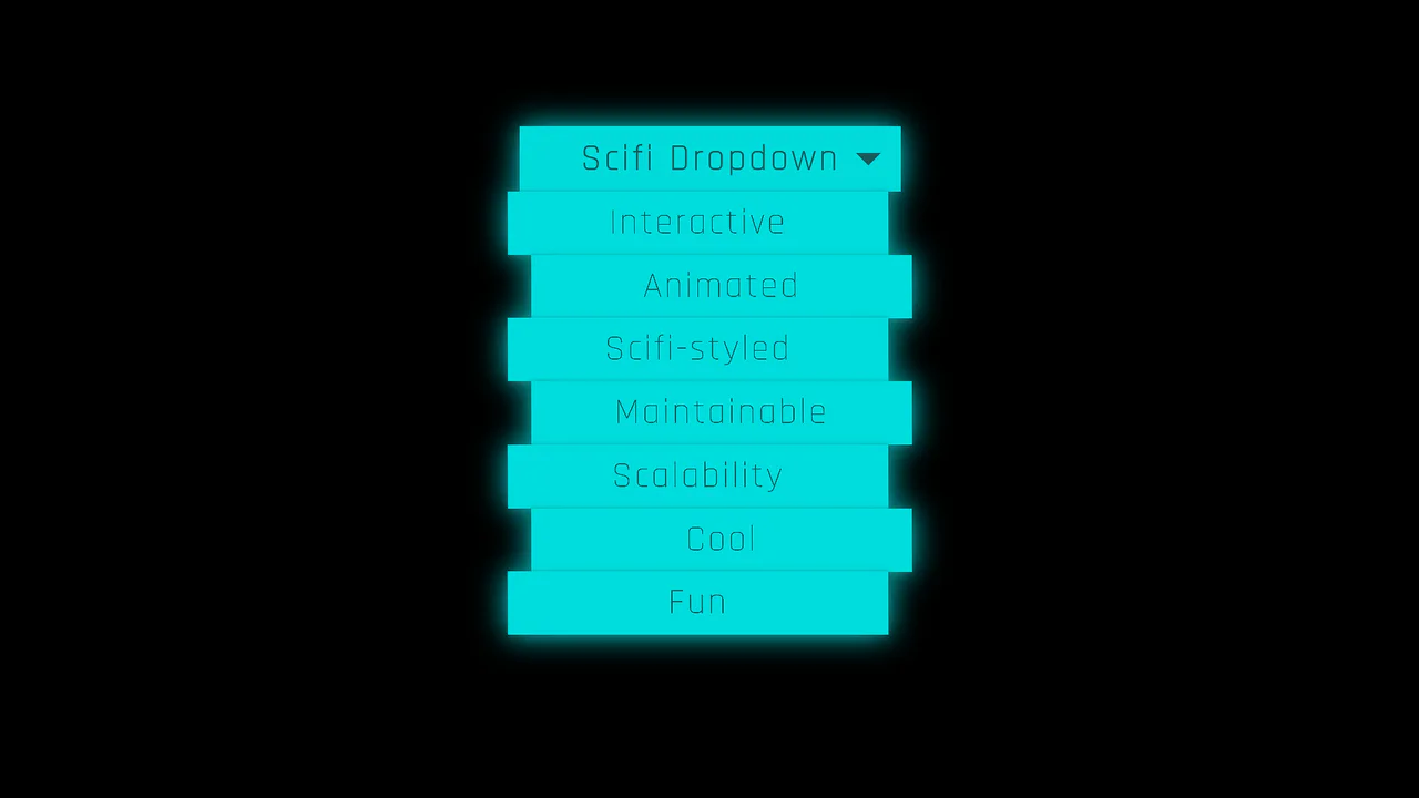
Futuristic Interactive Dropdown
This striking Sci-Fi dropdown leverages SCSS @for loops and conditional logic to dynamically stagger menu items in their hidden state. The dramatic reveal animation is achieved using complex CSS 3D transforms and skewing activated entirely by a single parent hover state.
See the Pen Futuristic Interactive Dropdown.

Damped Menu Bar using CSS @property
A superb demonstration of physically accurate damped oscillation animation, achieved using a registered CSS property (@property --progress) that controls trigonometric functions within calc() to drive the elements’ 3D movement.
See the Pen Damped Menu Bar using CSS @property.
Wobbly Underline Menu Effect
An elegant “Snake” navigation indicator effect using an SVG path and the pure CSS technique of troke-dasharray/troke-dashoffset for fill animation, where JavaScript is used only to toggle directional classes.
See the Pen Wobbly Underline Menu Effect.
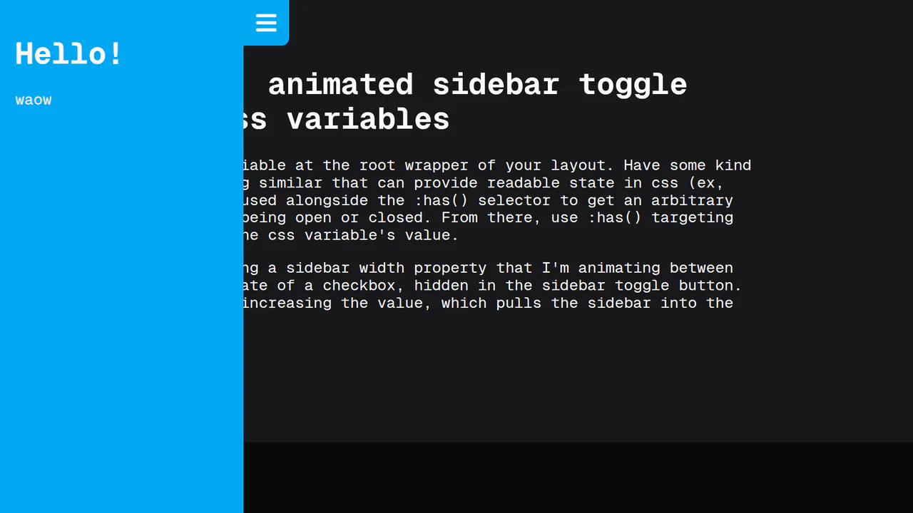
CSS Var Only Sidebar Toggle
This animated sidebar is built entirely with pure CSS using modern features. The key is @property for a smooth width transition and the :has() selector to track a checkbox’s state, enabling animation control without a single line of JavaScript.
See the Pen CSS Var Only Sidebar Toggle.
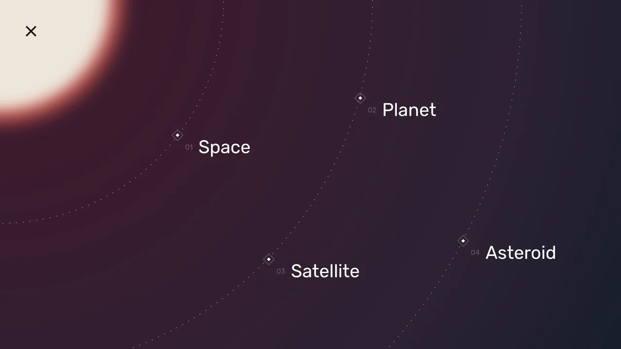
Space Nav: A Full-Screen Menu
An impressive menu example where all visuals are built with pure CSS and SVG. Clicking the burger icon triggers smooth animations for gradients, SVG arcs, and the background, while changing the overall page state with a single class.
See the Pen Space Nav: A Full-Screen Menu.
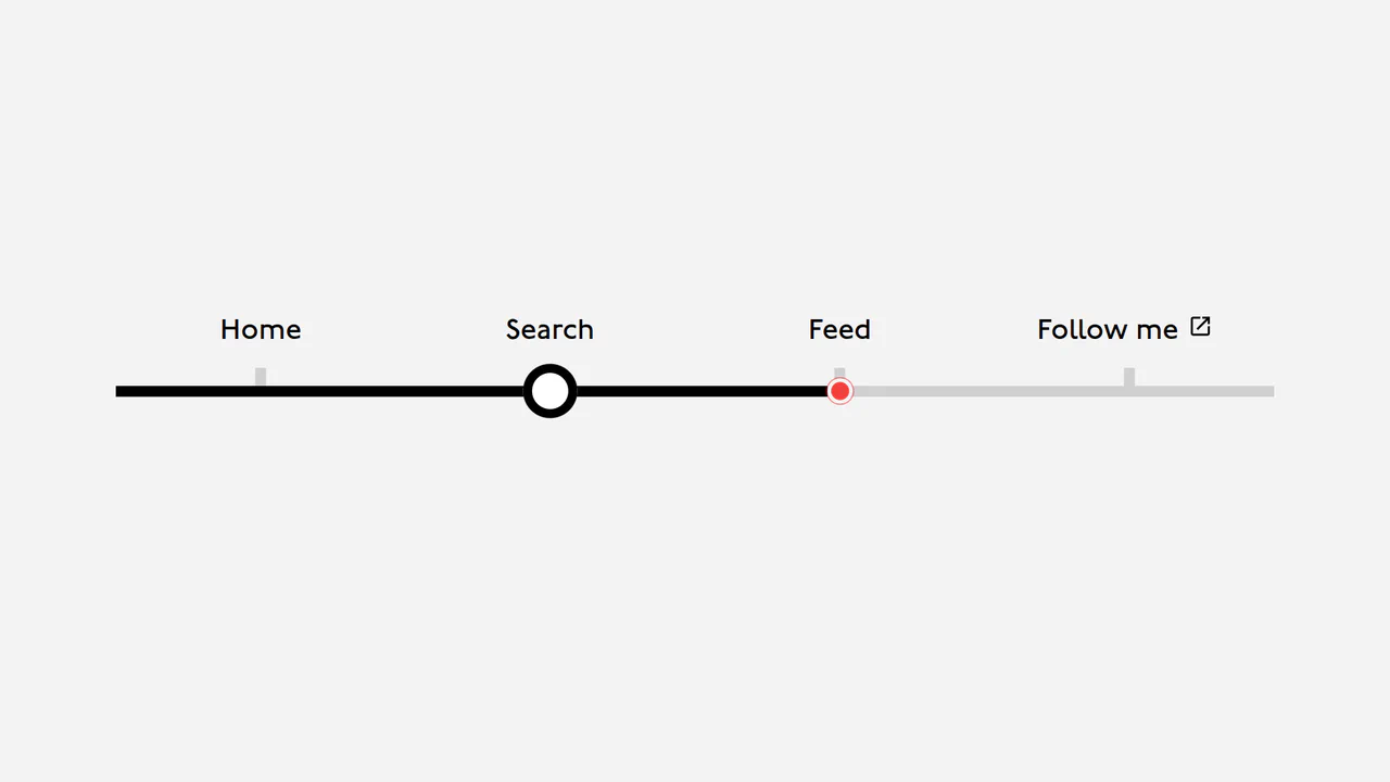
London Tube Map Navigation
A navigation component that showcases a clever use of CSS variables (--index, --position) for dynamic positioning. JavaScript is only used to update these variables on mouseover and click events, enabling complex and interactive animations.
See the Pen London Tube Map Navigation.
An adaptive navigation system featuring a CSS Grid/Flexbox layout. Hover effects on menu items are styled with smooth color shifts and box-shadow changes, offering a clean and responsive UI experience.
Responsive Sidebar
A flexible and customizable sidebar built with CSS Custom Properties - sizes, spacing, and colors are easily configurable. The complex choreography of element appearance is achieved through transition-delay, and tooltip content is sourced from data-* attributes.
See the Pen Responsive Sidebar.